The Omnipress website was redesigned for their internal content management system. The goals of the project were to reduce content and clarify the overall message and pair it with a clean layout and design.
A repeated visual system was created for the entire site in order to set expectations of the content for the end users. Each level of the site adheres to it’s own graphic rules while maintaining the given color scheme of the section.
Another part of the design was to reduce the competing graphics on previous versions of the site and replace with fewer product highlight images and simple iconography.
Project Responsibilities
Worked with marketing team to establish main goals for the site redesign. From initial planning work on creating initial design mockup utilizing Adobe InDesign. After initial mockups were approved all sections were mocked up utilizing the visual system established.
InDesign was selected so that the marketing team could create final language and provide a final approval of complete design with content prior to development work in the content management system.
All elements in the CMS, including any CSS and most jQuery, were initially setup by myself. Once setup was complete production was shared with marketing team members.
I utilized Bootstrap for grid and small element formatting, and the CSS for all major design elements were created from scratch.
Technology
- Adobe InDesign
- Microsoft Word
- Adobe Photoshop
- Bootstrap
- jQuery
- HTML
- CSS

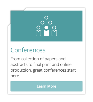
A major visual element for the Omnipress site was the navigation cards. A nod to the printing side of Omnipress business, the navigation cards were created to mimic the outline of paper and file iconography. This card layout provided the marketing team an opportunity to introduce each of the subsections of the site with a short description. These navigation elements also allowed the introduction of the section iconography used throughout the site.
These navigation elements are featured over different photography used as texture through the site. Black and white sections are used for subsection navigation areas while the color images are used to link out to internal and external resources such as white papers or blog posts.
Navigation card created entirely with CSS and HTML.
Background images utilize parallax scripting and CSS filter effects.


Mobile Responsive Design
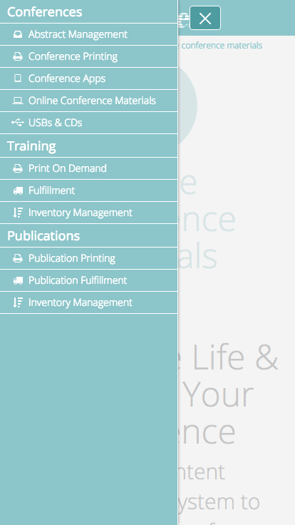
Mobile responsive websites are no longer a nice to have item, and the mobile experience received close attention and care so that all navigational and iconography systems were still a useful aspect to the design.
